


MY ROLE: Designer
THE SITUATION
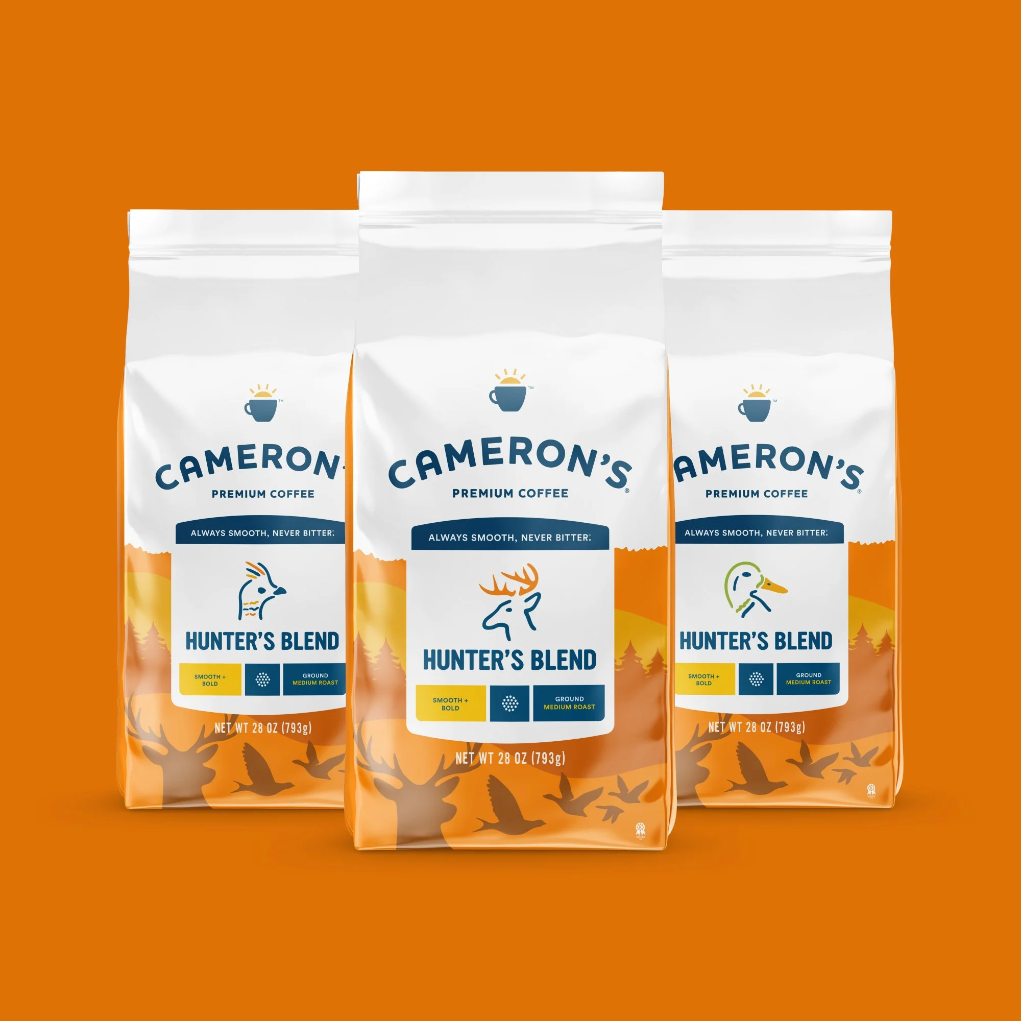
Cameron’s wanted to give their Hunters Blend packaging a bold new upgrade—one that felt fully aligned with their refreshed brand while standing out on shelf. The design needed to capture the rugged Midwest/Northwoods spirit and connect with their hunter-focused audience. To complete the system, they also needed a fresh suite of icons representing the primary hunting categories their consumers care about.